Tuesday, January 25, 2022

How magazines use colors effectively

The Hue Circle


The most common way to organize colors is with something called the hue circle (which is also called a color wheel). It is basically a chart that organizes all the hues around a circle. The colors also typically reduce in saturation the closer to the middle of the circle you go. However, one limitation of this tool is that brightness is not represented (there are no darker shades of colors).

The hue circle has many useful properties which can be used to find pleasing color palettes. There exist many relationships between colors that, when taken advantage of, can give certain tones to one's design and create harmony between the colors in your design.

Color Schemes

There are 6 main ways that you can design your color palette:
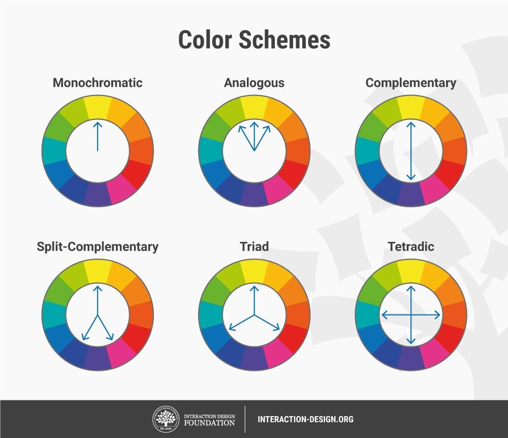
  • Monochromatic - The hue stays the same and only the saturation varies.
  • Analogous - Only a small range of hues is used.
  • Complementary - Colors of opposite hues (hues on opposite sides of the hue circle) are used.
  • Split-Complementary - A color and the hues around its complement are used.
  • Triad - Colors spaced 1/3 the way around the circle are used.
  • Tetradic - Colors spaced 1/4 the way around the circle are used.

Color Phycology

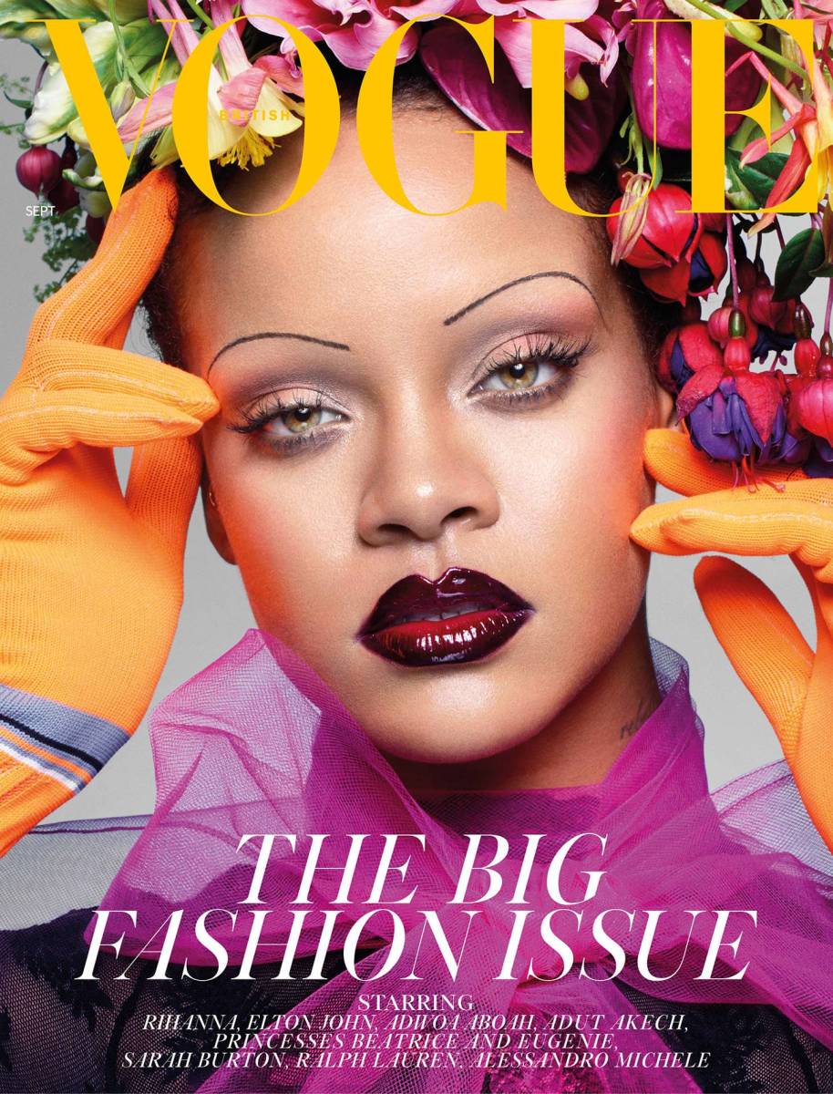
The selection of a color for a magazine (or any product for that matter) can have a big impact on how people perceive it. Some of the most common feelings toward colors are:
  • Yellow - for optimism and warmth (ex. National Geographic)
  • Orange - for friendliness and confidence (ex. Google Blogger)
  • Red - looks bold and exciting (ex. EdTech or Time magazine)
  • Purple - looks creative and imaginative (ex. Yahoo)
  • Blue - shows trust and dependability (ex. Microsoft or Technology Magazines)
  • Green - shows that the product is natural and healthy (ex. Whole Foods or Android)
  • Gray - shows balance and neutrality (ex. Apple)
And while these colors might not be used to convey exactly these things, their effect is powerful and color selection is critical.


Sources

Briona Gallagher Editor. “Color Theory: The Science and Art of Using Color.” Design Wizard, 12 Oct. 2021, www.designwizard.com/blog/design-tips/color-theory.

Ciotti, Gregory. “Color Psychology in Marketing and Branding Is All About Context.” Psychology of Color, 12 Aug. 2020, www.helpscout.com/blog/psychology-of-color/#:%7E:text=Color%20psychology%20is%20the%20study,brands%20or%20make%20a%20purchase.

“CD / Color.” YouTube, uploaded by Captain Disillusion, 18 Aug. 2020, www.youtube.com/watch?v=FTKP0Y9MVus.


Tuesday, January 11, 2022

Fonts in a magazine

 Font Psychology


The font a text is written in can give the text a certain feel and meaning. For example, the font Times New Roman has a serious, sophisticated look and would work well in a professional report, but it would seem overly serious in a party invitation. This is may be very different with other fonts. Additionally, Times New Roman has something called serifs, which are like little feet that the letters have. This gives an elegant, sophisticated, and generally professional look to the font, in contrast, fonts like Courier are what's called sans-serif fonts (or just sans fonts) and give a more casual tone to what's being said. See in this example:

    "Cindy took her dog out for a walk." - with serif
    "Cindy took her dog out for a walk." - sans serif

As you can see, the font with serifs has a more serious look to it and would probably be suited for an essay on dog walking, but the one in sans serif looks a lot more casual and would be good for a story.

Script fonts are designed to look handwritten and make the text look even more casual than sans-serif fonts.

Decorative fonts have extra embellishments and look very elegant, even more so than serif fonts.

    Text with and without serifs


How Tech Magazines Use Fonts Effectively

Tech magazines typically use both serif and sans-serif fonts. The big, styled text, like the titles, coverlines, bylines, and sometimes pull quotes are written in sans-serif fonts which give the magazine a sleek and techno look. However, the passages usually contain more sophisticated-looking serif fonts, as to not make the text too goofy. This is different from other magazines which frequently use serif fonts in their titles and headings. Overall, this makes the magazine look modern and technological while staying professional.


Font psychology

Canva. (n.d.). The definition of font psychology and how to use it. Font Psychology. Retrieved April 4, 2022, from https://www.canva.com/learn/font-psychology/

“Serif vs Sans Serif Fonts and When to Use Which | Adobe.” Adobe, www.adobe.com/creativecloud/design/discover/serif-vs-sans-serif.html. Accessed 4 Apr. 2022.


Aspects of technology magazine covers

Cover Image

One of the most distinctive aspects of technology magazines is the inclusion of objects on the cover image, while most other magazines have an athlete or model on the cover. Typically this is a picture of the tech included in the magazine, like an i-phone. This is mostly because, unlike other magazines, tech magazines aren't based on people, but on the technology itself. This is why you won't see a make-up case on the front of a passion magazine, because, in those kinds of magazines, it's about the people that use the products, not the products themselves.

Color

Technology magazines commonly have blue color schemes, as technological devices are generally perceived as being blue or emitting blue light makes these magazines distinctive, so when people see a blue cover, they know it's a tech magazine. Other magazines, such as sports and fashion, typically use warmer colors like red and yellow as they can be more expressive, eye-catching, and passionateNeutral colors are also used to create tones of being simple or dull and to draw people's eyes toward other elements. For example, a gray background can make the subject of the cover image stand out more. Since tech magazines don't usually have subjects in their cover images, they seldom use this technique.

Font

The font that something is written in can give what's being said a lot more meaning than just what's written. Most fonts can be split into two categories serif and sans-serif (without serif). Serifs are little 'feet' on the ends of letters in a font and can make it look more elegant and sophisticated, but can also make it look old-timey since those types of fonts originated from the fonts used in typewriters. Using sans-serif, on the other hand, will make the font more modern and bold, but may also look casual if used too frequently. Most magazines tend to mostly go with serif fonts in order to make the text look more elegant and professional. However, tech magazines are different. The old-timey look of serif fonts contradicts the other modern aspects of tech magazines, so they tend to go with sleek, bold, sans-serif fonts instead. However, tech magazines tend to stick with serif font in large bodies of text to prevent the text from looking unprofessional.

Big names

There are, of course, many big names in the technology magazine industry. One of the biggest, Wired, "Illuminates how technology is changing every aspect of our lives—from culture to business, science to design." And also, the aptly named Technology Magazine, which literally has technology in its name!

Examples

Tech Magazines


Notice how they have abstract cover images, blue coloration, and sans-serif fonts

Other magazines


Notice how they have people in the cover image, warm coloration, and serif fonts


Sources

Fashionista. “The 32 Most Memorable Magazine Covers of 2018.” Fashionista, 3 Apr. 2020, fashionista.com/2018/12/best-fashion-magazine-covers-2018.

Freemags. “Technology Magazine – November 2020 | Magazine PDF.” Free Magazines Online | PDF Magazine Download, 25 Oct. 2020, freemagazines.top/technology-magazine-november-2020.

Nast, Condé. “WIRED - The Latest in Technology, Science, Culture, and Business.” Wired, www.wired.com. Accessed 4 Apr. 2022.

“Serif vs Sans Serif Fonts and When to Use Which | Adobe.” Adobe, www.adobe.com/creativecloud/design/discover/serif-vs-sans-serif.html. Accessed 4 Apr. 2022.

“Technology and Innovation - Issue 4.” Pocketmags, pocketmags.com/us/technology-and-innovation-magazine. Accessed 4 Apr. 2022.

“Time Cover Store.” Time Magazine, timecoverstore.com. Accessed 4 Apr. 2022.

Monday, January 10, 2022

About this blog

About me

Hello, I am Jack Whitlock, a sophomore AICE media studies student at Patel high school.


Content of this blog

This blog will go through the in-depth process of creating a magazine.

Creative Critical Reflection

Here is a playlist of all the creative critical reflections I have made for this project on YouTube: https://youtube.com/playlist?list=PLetR...