The Hue Circle.svg/220px-Color_circle_(RGB).svg.png)
The most common way to organize colors is with something called the hue circle (which is also called a color wheel). It is basically a chart that organizes all the hues around a circle. The colors also typically reduce in saturation the closer to the middle of the circle you go. However, one limitation of this tool is that brightness is not represented (there are no darker shades of colors).
The hue circle has many useful properties which can be used to find pleasing color palettes. There exist many relationships between colors that, when taken advantage of, can give certain tones to one's design and create harmony between the colors in your design.
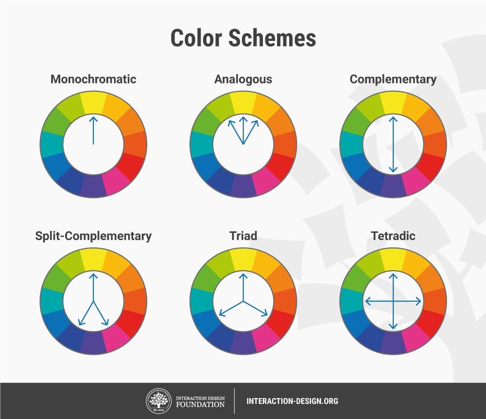
Color Schemes
- Monochromatic - The hue stays the same and only the saturation varies.
- Analogous - Only a small range of hues is used.
- Complementary - Colors of opposite hues (hues on opposite sides of the hue circle) are used.
- Split-Complementary - A color and the hues around its complement are used.
- Triad - Colors spaced 1/3 the way around the circle are used.
- Tetradic - Colors spaced 1/4 the way around the circle are used.
Color Phycology
The selection of a color for a magazine (or any product for that matter) can have a big impact on how people perceive it. Some of the most common feelings toward colors are:
- Yellow - for optimism and warmth (ex. National Geographic)
- Orange - for friendliness and confidence (ex. Google Blogger)
- Red - looks bold and exciting (ex. EdTech or Time magazine)
- Purple - looks creative and imaginative (ex. Yahoo)
- Blue - shows trust and dependability (ex. Microsoft or Technology Magazines)
- Green - shows that the product is natural and healthy (ex. Whole Foods or Android)
- Gray - shows balance and neutrality (ex. Apple)
And while these colors might not be used to convey exactly these things, their effect is powerful and color selection is critical.
Sources
Briona Gallagher Editor. “Color Theory: The Science and Art of Using Color.” Design Wizard, 12 Oct. 2021, www.designwizard.com/blog/design-tips/color-theory.
Ciotti, Gregory. “Color Psychology in Marketing and Branding Is All About Context.” Psychology of Color, 12 Aug. 2020, www.helpscout.com/blog/psychology-of-color/#:%7E:text=Color%20psychology%20is%20the%20study,brands%20or%20make%20a%20purchase.
“CD / Color.” YouTube, uploaded by Captain Disillusion, 18 Aug. 2020, www.youtube.com/watch?v=FTKP0Y9MVus.


No comments:
Post a Comment