Layout Selection

I decided to go with this layout because even though all of the layouts have similar horizontal margins, this one does the best job with its vertical margins. The text and image combos snugly fit the height of the page along with the title and infographic as opposed to other layouts which either felt too cramped or too stretched.
 |
| Page from IST magazine |
Changes to the Two-Page Spread
Now that I have the general layout for the spread down, I need to style it up. Aside from adding images, there were a few things that I felt needed attention
1. Justify
Instead of just haveing the text be left or right aligned, you can kind of have both at the same time. Justifying text makes it fit into a nice neet box. Most magazines use justified text to help seperate the text into descrete blocks or collums. This helps the text to fit together with the other page elements better and looks realy good.

2. Drop cap
It may be a little confusing for the reader to know where to start reading from. So, what most magazines do is make the first leter of the passage bigger to draw your attention to it. However, this proved to be very difficult with Canva since each text box has to have all the same font (size, color, and style). But with some finiky textbox manipulation and about half an hour of laying around with it, I was able to make a drop cap, and it looks pretty good.

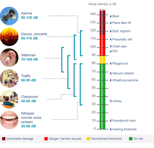
3. Infographic title
Curently, it isn't very odvious what the ifographic is without reading the passage, so I added a catchy tittle: "Turn dowm the sound" to let readers know that it's there to envourage readers to listen to headphones at a safe volume.

4. Images
Finaly, Images were added to replace the placeholders.
This is the final cover design:


No comments:
Post a Comment