Thursday, April 21, 2022

Creative Critical Reflection

Here is a playlist of all the creative critical reflections I have made for this project on YouTube:

https://youtube.com/playlist?list=PLetRR5EIlniZkFp0pIKz5LIl6mNRIXwDQ


Here they are separate:

CCR 1 - Presentation: https://youtu.be/VhLIa5kDErs

CCR 2 - Advertisment: https://youtu.be/ghOGNlcfHLo

CCR 3 - Interveiw: https://youtu.be/BiibWcfZvqk

CCR 4 - Tutorial: https://youtu.be/UfXHwA9P0Bc

Friday, March 25, 2022

Two-page spread revisions


After designing my first draft of my two-page spread (seen to the right) I showed it to my peers and got feedback.


1. minor changes

There were some minor errors that were easy to fix including capitalizing titles/headings and left-aligning the 3rd paragraph's heading.


2. Text size

I received multiple comments on the text size and that it was too small. However, I believe that, without removing content, there isn't much room to increase the text size without making the margins too small. However, I think that if the spread was enlarged to the size of an actual magazine, the text would become very easily readable and the text size not needed to be increased.

3. Byline and page numbers

All magazine articles need to have an author credited for them a page number. I completely forgot to add them, so I've added them now.


4. Theme was too casual

There were a few comments saying that the simple graphics were too casual and don't fit the genre of a tech magazine. However, this is an intentional deviation from tech magazine standards. I wanted this magazine to be like a guide into technology for people that don't know very much about technology, such as children, older people, or people who just aren't very tech-savvy. The casual theme is there to make the magazine more approachable to its audience.


Final 2-page spread design:


Thursday, March 10, 2022

Two-page spread final design

Layout Selection

Of the three cover designs from the last blog post, I decided that layout 1 was the best layout for my two-page spread.

I decided to go with this layout because even though all of the layouts have similar horizontal margins, this one does the best job with its vertical margins. The text and image combos snugly fit the height of the page along with the title and infographic as opposed to other layouts which either felt too cramped or too stretched.

Page from IST magazine
The alternating pattern of text and images is a common design pattern found in magazines to integrate images into text, as well as break up the text and make it easier to read. This is especially visible in tech magazines since they have a lot of images.


The infographic in the two-page spread is based on this infographic from Cochlea, and many others like it, that compare decibel values to examples. The one in my magazine just has added stylization to make it look like a volume slider being turned down.


Changes to the Two-Page Spread

Now that I have the general layout for the spread down, I need to style it up. Aside from adding images, there were a few things that I felt needed attention

1. Justify

Instead of just haveing the text be left or right aligned, you can kind of have both at the same time. Justifying text makes it fit into a nice neet box. Most magazines use justified text to help seperate the text into descrete blocks or collums. This helps the text to fit together with the other page elements better and looks realy good.

2. Drop cap

It may be a little confusing for the reader to know where to start reading from. So, what most magazines do is make the first leter of the passage bigger to draw your attention to it. However, this proved to be very difficult with Canva since each text box has to have all the same font (size, color, and style). But with some finiky textbox manipulation and about half an hour of laying around with it, I was able to make a drop cap, and it looks pretty good.

3. Infographic title

Curently, it isn't very odvious what the ifographic is without reading the passage, so I added a catchy tittle: "Turn dowm the sound" to let readers know that it's there to envourage readers to listen to headphones at a safe volume.

4. Images

Finaly, Images were added to replace the placeholders.


This is the final cover design:


Tuesday, March 8, 2022

Two-page spread layout

Two-Page Spread Article

This is an article I wrote that I will be using in my two-page spread:

The invention of headphones

In the modern, technological society that everyone lives in, people are surrounded by visual and auditory stimuli. People can watch videos on their little smartphone screens while they’re on the bus, or at home on the couch at their own leisure and convenience.

But what about sound? How can one listen to all of this digital content at their own convenience without turning the world into a continuous cacophony of commotion? Well, that’s what the invention of headphones was for: to allow people to easily get clear, understandable, and private audio from their devices, without disturbing the people around them.

This has made headphones, and their close relatives the earbuds, some of the most widely used accessories for mobile devices worldwide.


The risks of headphones

However, there is a major problem with these devices: the volume. While the wide range of volumes that these devices can produce is very useful, the upper end of this range can go beyond what human hearing has ever needed to withstand before.

According to the World Health Organisation (WHO), headphones can produce noise up to 102 decibels, which is about 20 decibels higher than even relatively loud talking.

However, don’t be deceived, 20 decibels may not seem like much, but since decibels measure sound exponentially, 20 more decibels actually means 100x louder sound.

To make things worse, headphones are putting that sound right up next to your ears! This can be especially bad if exposed to for long periods of time. 


The damage it can do

If you listen to headphones that are too loud, too close to your ears, or for too long, it can cause irreversible damage to your ears and may lead to permanent hearing loss.

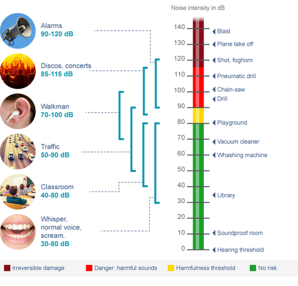
The amount of time that it can be safe to listen to certain volumes can be seen in the diagram below. However, it should be noted that this is just an estimate and you should always play it safe. 


(the next page will have an infographic on it)


Two-Page Spread Layout


Below are 3 ideas that I had for the layout of my magazine's two-page spread. Since these are just layouts, they are not final and are missing pictures and other elements.


Layout 1 - passage 3 paired with infographic

This layout has the first two passages on the first page which are on separate sides of the page (to space out the text) and are each paired up with an image.

The other page has the third passage, also paired up with an image, and with the infographic, which paragraphs 3 references, below paragraph 2.


Layout 2 - infographic alone on right page

This layout has all of the passages on the first page. The first passage is paired with its image vertically and the other two passages do not have an image.

The other page has just the infographic, so the infographic is stretched a bit to make up for the extra space

Layout 3 - infographic on left page

This layout has the infographic on the first page, but because of the title of the passage no other content can be added to that page

The other page has all of the passages on it. They are formated similar to layout 1, where each passage is paired with an image in a staggered fashion.

(In my opinion, this layout has a bit too much empty space on the left page and is a bit too cramped on the right page)


Tuesday, March 1, 2022

Tech magazine passages research

Audience

Tech magazines usually speak in a serious, matter-of-fact tone as opposed to other magazines, like science magazines, which might have a more fantastical tone. Additionally, tech magazines are most often written from a third-person point of view. It is usually some unbiased writer talking about things that other people have said and done, whereas other magazines may have someone who is an expert on the subject write the article from their POV.

Most magazines refrain from high vocabulary, technical wording so that they can appeal to a wider audience. Tech magazines are no different: they don't use heavy technical language and thoroughly explain complex topics so that anyone reading can understand it at a baseline level. This makes sense, as the more accessible a magazine can be to a wide audience of people, the more copies it can sell.

Excerpt analysis

Here are two quotes, one from Wired, a popular tech magazine, and one from Discover, a popular science magazine:

Black androids replicate the actions of human beings, especially in the performance of onerous chores. One notable example from Jones-Imhotep's research is Dederick's Steam Man of 1868. The head and torso of the android, which is powered by a steam engine, takes the form of a Black man pulling a cart, a replacement for a draft horse. In New York City, Jones-Imhotep says, Black androids like Dederick's Steam Man “clustered along Broadway, where they formed part of the culture of minstrelsy, blackface, and racist spectacle.”

- excerpt from "The History - and Disturbing Resurrection - of Black Androids" from Wired


In March, after years of analyzing and confirming data, astrophysicists reported that the IceCube Neutrino Observatory, a detector buried at the south pole, had picked up an unusual signal in 2016. It suggested that a particle called an antineutrino had crossed space and time - originating far beyond our galaxy - before smashing into Antarctica and releasing a particle shower in the ice.

- excerpt from "Alien Antimater Crashes Into Earth" from Discover


Upon examination, the Wired excerpt is very descriptive and objectively talks about its subject: Black Androids. The excerpt also makes references to experts/researchers such as Jones-Imhotep instead of being written as if it was by an expert (the article was not written by Jones-Imhotep but by someone at Wired).

On the other hand, the excerpt from discovering conveys more wonder and looks more as if it was written by an expert as opposed to a layman author since they are able to describe the event in detail without making references to experts.


Sources

Heffernan, Virginia. “The History—and Disturbing Resurrection—of Black Androids.” Wired, 18 Feb. 2022, www.wired.com/story/history-disturbing-resurrection-black-androids.

Ornes, Stephen. “Alien Antimatter Crashes into Earth.” Discover Magazine, 21 Dec. 2021, www.discovermagazine.com/the-sciences/alien-antimatter-crashes-into-earth.

Wednesday, February 23, 2022

Table of contents revisions

 Feedback


After designing my first draft of my table of contents (seen to the right) I showed it to my peers and got feedback.

There were some mirror tweaks (Kirby is misspelled as "Kerby" and I need to retake the pictures because the background-remove looks bad), but also some major changes that I was recommended that I wanted to test before committing to them.


Recommended changes

From the feedback I got, four major changes have been distilled:
  • Align dashes in article titles
  • Align article titles to header (ie. left align the headers)
  • Recolor headers (Green -> purple)
  • resize pictures
  • change background color to blue
I will implement each change separately, and then choose whether or not it is better than the original.

Aligning articles

A lot of my articles were not aligned with each other. In most magazines, the starts of all the article names are lined up, and the end of each page number is aligned on the other side. Before, I just moved the text boxes left or right in Canva to try and line up the articles. However, Canva does not allow me to move the text to the precision I needed in order to align the articles up. So, I separated the article names from the page numbers, so I could line up each article name's text box exactly (since Canva snaps the edges of textboxes together) and have the page numbers as separate text boxes that were right-aligned. This gave the desired effect, so I implemented it for all the articles.

This is what the table of contents looks like now:


Align headers

As one may notice, the headings for articles are offset from the list of articles, one piece of feedback I got was to move them more to the left. Here is what that looks like:

I think that this does look better, as it strengthens the line that all of the article titles are aligned with which is present in most other magazines' TOCs.


Recolor headers

I got feedback to get rid of the green colors and make them bluer, so I made these changes:
"Contents" header:     #41910D -> #415484
article headers:           #224B07 -> #070F64

This is what that looks like compared to the green text:


I personally think that the green text looks better, as it matches the color scheme of my magazine's cover, but either one would look good in a magazine.

Final TOC design

After all of the revisions and retaken images, here is my final draft of the table of contents. I think it turned out well and will look good in my magazine.


Creative Critical Reflection

Here is a playlist of all the creative critical reflections I have made for this project on YouTube: https://youtube.com/playlist?list=PLetR...